Cover - clean effortless look


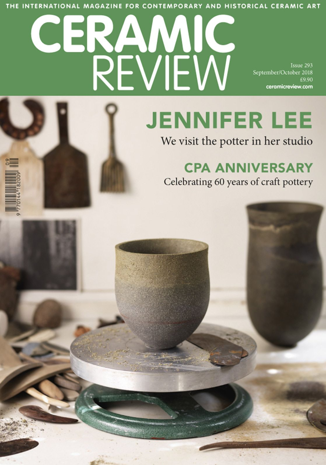
I enjoy how ceramic review alters the colour of the banner/ skyline behind their masthead to suit the cover image
it also helps the masthead stand outThe mastheads of the magazines are thick bold fonts accompanied much thinner fonts- this combination works well
clay times does something very interesting by using the colours of the image for the test present in tag lines, cover lines, etc.
most of the above magazines use the vacant spaces that aren't encompassed by the focus of the frame as areas to include tag lines and cover lines
No comments:
Post a Comment